Friday, 2 January 2015

Bibliography

Arbus. D, Hermaphrodite and a dog in a carnival trailer, Maryland, 1970

Arbus. D, Two Female Impersonators Backstage, NYC, 1961

Arbus. D, Man in Boots

Betza. G, Commuting, 2008

Betza. G, Commuter Down, 2008

Betza. G, Neutral Milk Hotel, 2014

Butler. G, The Next Big One, Eureka Magazine,  2012

Butler. G, Syria, The Times, 2012

Butler. G, Untitled, G2, 2012

Chadlonius, Bird.

Chadlonius, Dapper

Chadlonius, Gorilla Head

Chadlonius, Suicide King

Fairey. S, Nico

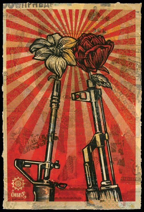
Fairey. S, M16 V.S AK47

Fairey. S, Toxic Dept

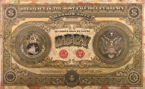
Fairey. S, Two Sides of Capitalism

Fairey. S, Your Eyes Here

Foldvari. D, Debt, 2008

Foldvari. D, Dickens Dark London, 2012

Foldvari. D, Untitled, 2008

Gibbon. J, War Mart, ‘Accessories’

Gibbon. J, War Mart, ‘Deal’

Gibbon. J, War Mart, ‘Wine’

Kruger. B, Not Ugly Enough, 1997.

Kruger. B, Untitled (Your Body is a Battleground), 1989

Kruger. B, Who do you think you are?

Kugler. O, Burkina Faso, 2012

Meyer. R, Beyond the Valley of the Dolls, 1970

Meyer. R, Faster, Pussycat! Kill! Kill!, 1965

Mucha. A, Job, 1896

Mucha. A, Monaco Monte Carlo, 1897

Mucha. A, West End Review, 1898

O’Farrell. L, St Ives, Cornwall, 2014

O’Farrell. L, New York, 2011

O’Farrell. L, New York City, 2013

Stromholm. C, Carmen, 1950

Stromholm. C, Kissmie, 1950

Stromholm. C, Nana, 1950

Thompson. M, At the Bottom of Her Valley of No Love

Thompson. M, Plot Magazine - Transgender

Thompson. M, The Globe & Mail – Just Like His Father

Weege. W, Don’t Miss America in ‘77, 1976

Weege. W, In Every Government There Exists, 1967

Weege. W, Take a Letter to Mary, 1971

Weege. W, Whose Gold Standard, 1976

Weege. W, 2 Works: Fern; Untitled 1971

Weege. W, 3 Works: Taurus; Aries; Virgo


Butler, J. (1990) Gender Trouble: Feminism and the Subversion of Identity. London: Routledge.
Butler, J. (2004) Undoing Gender. New York: Routledge.
Duncan, R. (ed.), Smith, MJ. (ed) (2012) Critical Approaches to Comics. New York: Routledge.
Kukkonen, K. (2013) Studying Comics and Graphic Novels. West Sussex: John Wiley & Sons, Ltd.

Simonson, L. (2007) DC Comics Covergirls. New York: Universe Publishing

Stefan Sagmeister

2/01/2015

I met up with some family relatives over Christmas and one of my cousins-once-removed, showed me the work of Stefan Sagmeister.

Sagmeister has done a series of photo prints using green and red printed on to the same page. When a a red sheet of plastic is placed over the top of the image, the green does not register, leaving a different image.


Image behind red sleeve.


Image out of red sleeve.


Before and after red sleeve.

This may be a good technique to show the duality of the trans-gender subjects I will be using in my project.

I pair of glasses with two red lenses, much like the 3D glasses you can buy, could be left by my work (during the show). When you put them on you will see a different image. It may produce an interactive quality to my work which I find appealing.


Flat Colour Experiment

2/01/2015

I used one of the photos of Oliver to reference an image using pro markers. This was to see how flat the colour would dry.


It was different not using black for shadow but I'm happy with the results, although I don't think I'll use this technique for any fore-ground subjects.

My Emulsion Prints

2/01/2015

I had a go at emulsion printing after looking at the work of Julia Boyd.

I like the results and I'm trying to figure out how I could use this technique in my work. It will more than likely be a background filler or part of collage.


I have to think more about the base emulsion coat that I print on to. I think the best result is where I let the brush marks stay on the page and not cover the whole area of the paper.

Shepard Fairey

2/01/2015

First post of the new year and what better way to start off with than the American artist/illustrator, Shepard Fairey.

Fairey's work uses flat colour to create the various shadows and tones on his subjects. The colours he uses complement the image and give the pictures a contemporary aesthetic.

The message of his work is akin to the very best graffiti art: It's gutsy, eye-catching and more importantly relevant!


Toxic Dept Mural


Nico Canvas


M16 V.S AK47


Two Sides of Capitalism (Bad) Mural


Your Eyes Here Canvas

As stated in earlier posts concerning the use of flat colour, especially in posters, I think the visual nature is very captivating. Some of the deeper tones on closer inspection are quite similar to some of the techniques I use in my work. The mix of illustration and graphic design is very appealing and again, the use of red, white and black is incredibly eye-catching.