Thursday, 18 December 2014

Julia Boyd

18/12/2014

I t must be the time of year or something! I've discovered another artist today who's work has given me more inspiration!

Julia Boyd is a photographer based in Australia. The pieces of work that captured my attention are her emulsion prints of some of her photographs.

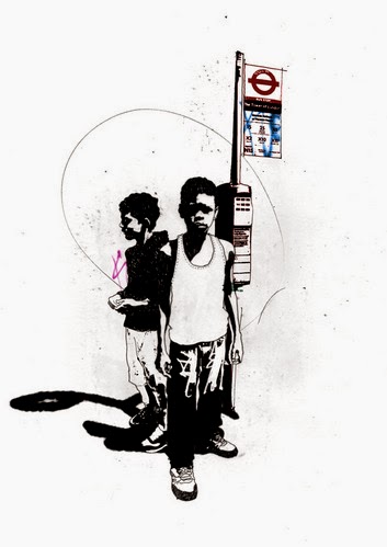
This technique leaves a ghostly image of whatever print you use during the process.


Boyd. J, 2012


Boyd. J, 2012


Boyd. J, 2012


Boyd. J, 2012

I first came across this when I saw some work a fellow student had done at university. It did not register at the time as I was too involved with my own work, but sitting through a recent presentation, another student also displayed some emulsion prints and something clicked in my creativity.

I'm definitely giving this a go. Printing has seemed like too long a process for me to use effectively in my work, this technique looks like it might fit the bill though!

Can't wait!


Michelle Thompson

18/12/2014

I've been looking at the work of Michelle Thompson, a prominent UK illustrator. She has worked with many top clients from The Guardian to The LA Times.

Working in a range of media from paint and inks to collage using her own photos and those collected from outside sources. This technique offers a broad range of creating imagery in an interesting and contemporary manner.

I hadn't really considered collage for my work until studying her illustrations.....but I think I might be hooked!


Plot Magazine - Transgender


The Globe and Mail - Just Like His Father


At the Bottom of Her Valley of No Love

I absolutely love her work! Some of my work does involve moving my own illustrations around using Photoshop, but I never really used a mixture of my illustrations and photographs.

I think it's time to have a go.


Saturday, 13 December 2014

Referencing Hiedi

13/12/2014

I had a go at producing something, that might look like one of my finished illustrations for my project. I didn't illustrate it in the drawing sense, as I feel this will be too close to what I have to do in the realisation semester of my course, so I just used the photos I took and some photoshop brushes and text.


It's definitely getting closer to what I want my final pieces to look like, although I need some more themes to my ideas, or rather not include so many differing images of the subjects doing different things. For example, create one finished illustration/picture of Oliver applying his make-up, maybe use two to three images of this process he goes through, to come up with a finished piece of work.

Greg Betza

13/12/2014

An American illustrator Betza has done a series of reportage illustrations based on his commute on the subway and also at a concert of one of his favourite bands, Neutral Milk Hotel.

I'm still undecided if I want to incorporate this on site style of drawing for my project. I get carried away trying to get a polished look to my illustrations, which you can only achieve through longer periods at a sketch book......certainly not the seconds you get to capture someone on stage, or before someone realises you are drawing them while they're sat on the train journey home.

I do admire the gutsy nature of this form of illustration though....and something keeps on bringing me back to looking at the simple lines of all the reportage illustrators I've been looking at.


Betza, Neutral Milk Hotel, 2014.


Betza, Neutral Milk Hotel, 2014.


Betza, Neutral Milk Hotel, 2014.


Betza, Sketching The Line, 2008.


Betza, Commuter Down, 2008.

To be able to do this style of drawing for my project is going to prove a little more taxing in regards to drawing at The Attic, due to the exotic nature of the club, but other subjects such as Heidi whom I meet at her mothers house, may prove easier to study.


David Foldvari

13/12/2014

I've blogged about this artist before, a firm favourite of mine. I love his use of black and the composition that he executes.

He makes some very political statements that people can't ignore. Something I very much admire in today's climate.

The mix of simple lines with some areas of exceptional detail, make for some interesting concepts.


Debt


Untitled


Untitled

There is a bluntness in Foldvari's work, something that makes his illustrations unique to the political agendas of today.


Alphonse Mucha

13/12/2014

After studying the work of Christer Stromholm, I thought about other 'French' art that captures the decadent nature of certain cities. The founder of Art Nouveau, Alphonse Mucha has to have a mention here. The aesthetic nature of his work, showing the female form with intoxicating swirls and colours, is something that may lend itself to my project.


Job, 1896


The Precious Stones, Ruby, Amethyst, Emerald, Topaz, 1900


Lance Parfum Rodo, 1896

I find his style extraordinary for the time period. A very technical ability mixed with a graphic design, that wouldn't be out of place today.

His use of borders and flat colour is very appealing and how these relate to the main subject is something that I'd like to try and investigate for the subjects of my work.


Tuesday, 9 December 2014

Hellraising Heidi!

9/12/2014

After talking to one of the students at uni about my project, she got me in touch with a friend who does drag shows.

Oliver lives in Sheffield, although originally comes from Derbyshire, Belper in fact. My mother and sister live there as do Oliver's! This meant we were practically related. I arranged with him to do a quick photo shoot at his mothers house.

As I walked up the drive of his house, I wasn't sure what to expect. T-Girls are different to Drag Queens as it turns out, and I didn't really know if I should handle Oliver aka 'Heidi' any differently.

All my fears subsided as the door opened and I was met with a heavily made up face but still in his 'civilian' clothing.

'Aye-up mate' was the welcome and after a quick introduction he said he'd be about twenty minutes to finish getting ready.

Oliver looks a little like the late 'Corey Haim'.


We kept on chatting from different rooms as he changed in to 'Heidi'.

Heidi: 'Have you ever zipped up a gay guy in drag?'

Me: 'Nope!'

Heidi: 'Well.......you're about too.'

It's not often that I'm speechless but this was definitely one of those occasions......as Heidi stepped out of her bedroom.


I was pretty astounded by the transformation. I don't know if it was because of the statuesque figure in high heels, or the fact that Heidi is only 22 years old, compared to the retired men that I have been photographing as T-Girls, but there was a different aura about her entirely!

I was happy with the reference photos, especially with the shadows we were able to get and I'm looking forward to working on the images.


It was also interesting to see the transformation of Heidi, back to Oliver. This is something that needs addressing in the project.


The Lovely Lana

9/12/2014

After visiting The Attic again for reference material, I had the pleasure to meet another regular there. Lana has been coming to The Attic for a while now, the only reason I've never met her before is because she does shows in Benidorm.

Lana differs from Gillian, in that she only spends roughly three days of the week as a man, and this is only to carry out some essential chores which would otherwise prove difficult as Lana.


Lana is a little easier to direct for reference photos and is more forthcoming generally, in front of the camera. I can only imagine this is because of the shows she does abroad.

Unfortunately she wouldn't show me her routine.

Shadow's are where it's at!

9/12/2014

Carrying on from the Christer Stromholm post, I decided to use one of his photos as reference for a new direction in technique. I realised that my previous work on this project has not really involved shadow in the photos I have taken. This has meant I have unconsciously drifted away from the style I am used to.

I picked a Stromholm photo that makes good use of facial shadow (of which there are many) and decided to have a go at another rough image.


I decided to use pro-marker directly on to the paper, without a pencil reference first, which has resulted in a slight mis-match in the eyes. I'm not too bothered about this as it was just an exercise for the sketchbook. My black pro-marker also ran out of ink.

I then scanned it in to photoshop and worked on it some more.


This is getting closer to what I want to achieve. The reference to Place Blanche and a certain French poster quality is quite appealing too. I will look in to the Art Nouveau movement, as the whole feel of those particular art works, has an aesthetic that appeals to my project topic.